Promotional Products Are Designed To Elicit a Response From Your Client
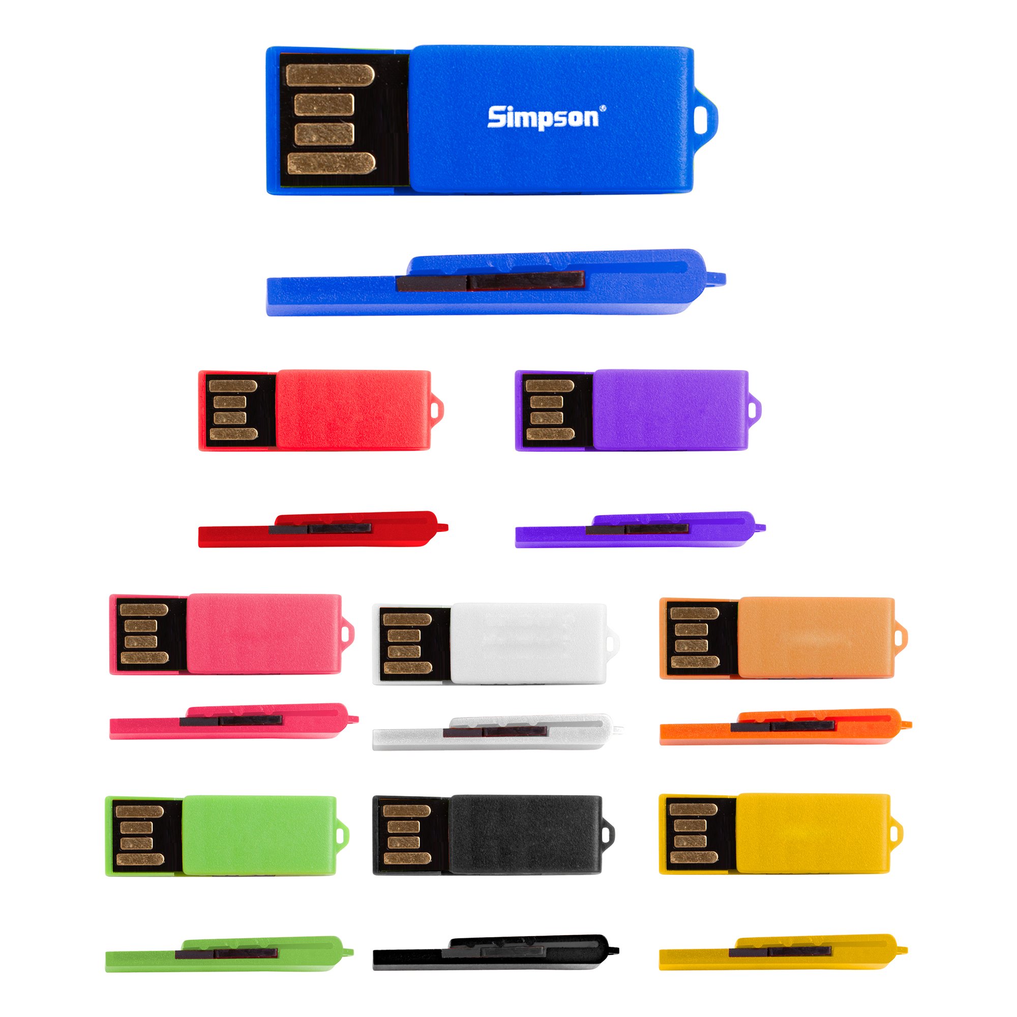
Whether you’ve selected a high-quality pen, a keychain flashlight, a travel mug, or a desk calendar as your promo item, the goal is to elicit a lasting and positive response from your client. One of the key considerations to make when strategizing around your promotional item purchase is to think about the impact that various colors will have on your target audience. Colors have been linked to physiological reactions in humans, so it pays to delve a little deeper into the impact that color selection will have on the effectiveness of your promotional item.
What Colors Should You Select For Your Promotional Items?
Considering the main color selections for promotional items is important as it can build the emotional link to your company or product.
Red is a bold choice for any marketing team, as it can induce feelings of anger, uneasiness, and stress. That said, just as red can range from lighter, pink-tinged shades, to darker, sophisticated variants, the emotion that is tied to this powerful color is undeniable. Red should be restricted to those items that scream out, “look at me!” Darker reds tend to evoke feelings of elegance, while lighter shades are fun and involving. Mid-hue reds tend to demand attention, think fire trucks, emergency vehicles, open flames, etc.
Blue is generally considered a calming color, and can be used quite effectively in promotional items that represent tranquility, peace, and harmony. Blue colors generally evoke an opposite reaction to reds and are useful for the marketer who wants to convey a sense of trust, calm, and serenity.
Green is a terrific color for the company who wants to be associated with fresh ideas, environmental conservation, and the beginning of something important. Green is fresh and rejuvenating. Shades that are too dark (think . hunter green) can come across too studious and stodgy, but just about any shade of green elicits a positive response from clients.
Yellow is a fun and uplifting color that always manages to put a smile on the face of the client. Yellow is associated with the sunshine, spring and summer, and outdoors activities. Yellow is a color often associated with happiness. That said, it isn.t normally the color of choice when attempting to convey a serious message.
Black screams formal, regal, and professional, but it can be a little depressing if overused. Black, when combined with the steely professionalism of silver or platinum, can deliver a powerful statement of elegance and achievement. Limousines and luxury cars are frequently seen in either black or silver as these two colors certainly evoke a feeling of achievement.
Match The Color Of Your Promotional Item To Your Company Logo
Sometimes, conducting a thorough, psychological analysis of color schemes and tonal variations is digging way too deep. Simply match the colors of your company logo and call it a day! With your brand as the focal point on the promotional item, you’ll be able to build the brand identity you’re seeking, simply by selecting the colors you already use.
The color is an important consideration to make when selecting promotional items for your organization. After all, you don’t want to end up seeing red, feeling blue, or finding yourself green with envy!
Introducing “Where Success Meets Swag”—an editorial series designed to put business owners in the spotlight. Follow along for advice from…
What’s your favorite pen in your desk? For many people, Pentel® is their go-to brand, both for their style and…
There's a lot involved with running a business. You've got to manage your inventory or services, bring in customers and…
Work uniforms often get a bad rap. That’s because a lot of businesses aren’t picking the right outfits for their…
Welcome to your step-by-step guide to crafting the perfect card! The special meaning we attach to a hand-written card goes…
If you’re looking for custom apparel that feels good, looks good, and can hold up to frequent use, you might…